WIN
Project:
WIN Rebrand
Client:
Women’s Inclusion Network (WIN) at The Walt Disney Company
WIN focuses on raising awareness on women's representation and addressing solutions to the needs of women in the workplace. They provide relevant content, tools, and allyship to support the organization and the wider community. Their aim is to empower members to advocate for themselves, enhance their leadership skills, and offer support and solutions to fellow colleagues.


Inspiration + early development
During the early concept phases, I was exploring a direction that leaned towards a more serious, almost conference-style approach, as seen in the treatments for "Win," "Women in Marketing," and "Women in Leadership" above. However, I soon realized that it would better align with WIN to develop a concept featuring a bold and empowering color palette. This new direction swiftly influenced the design of the logo.

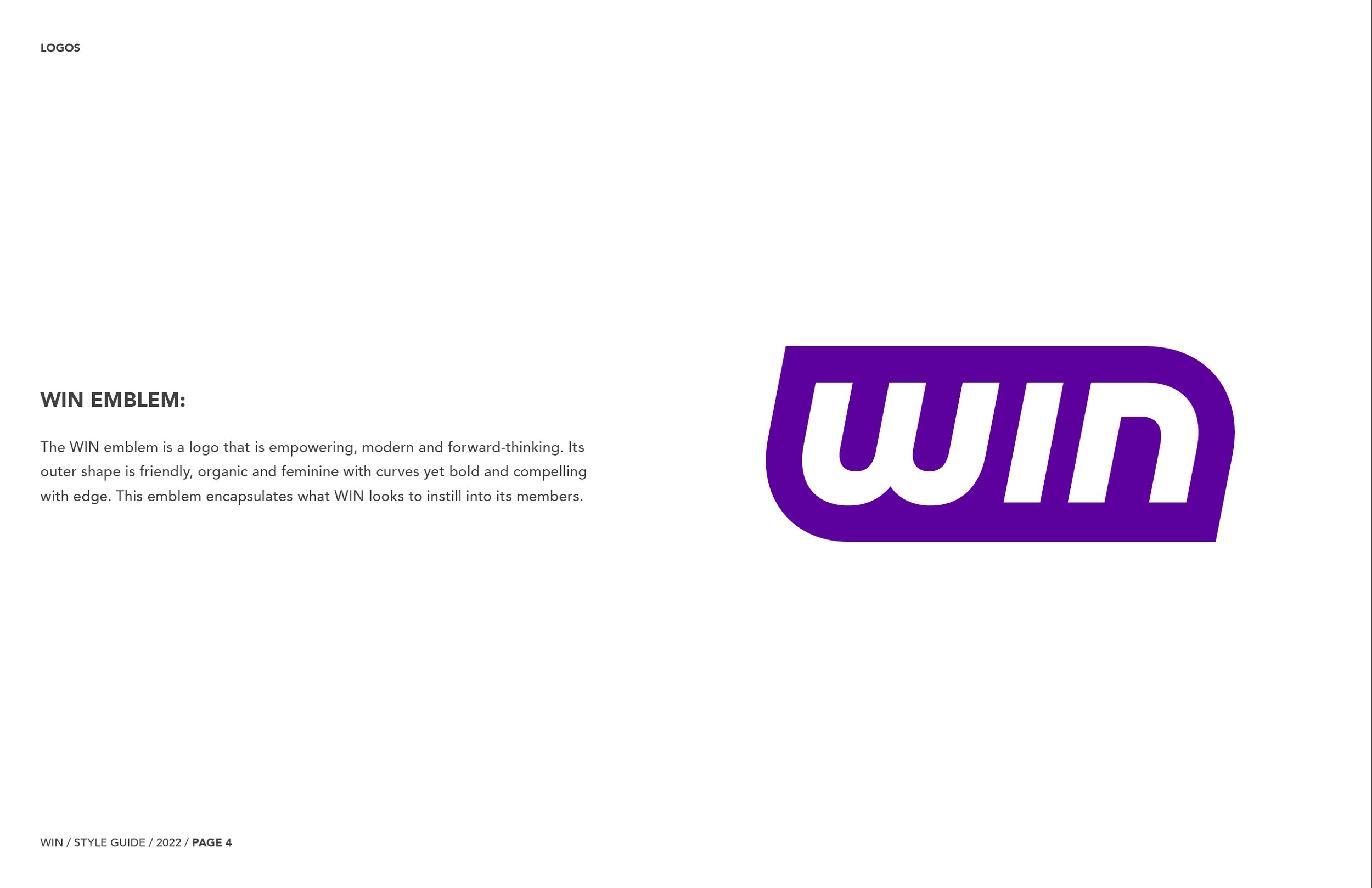
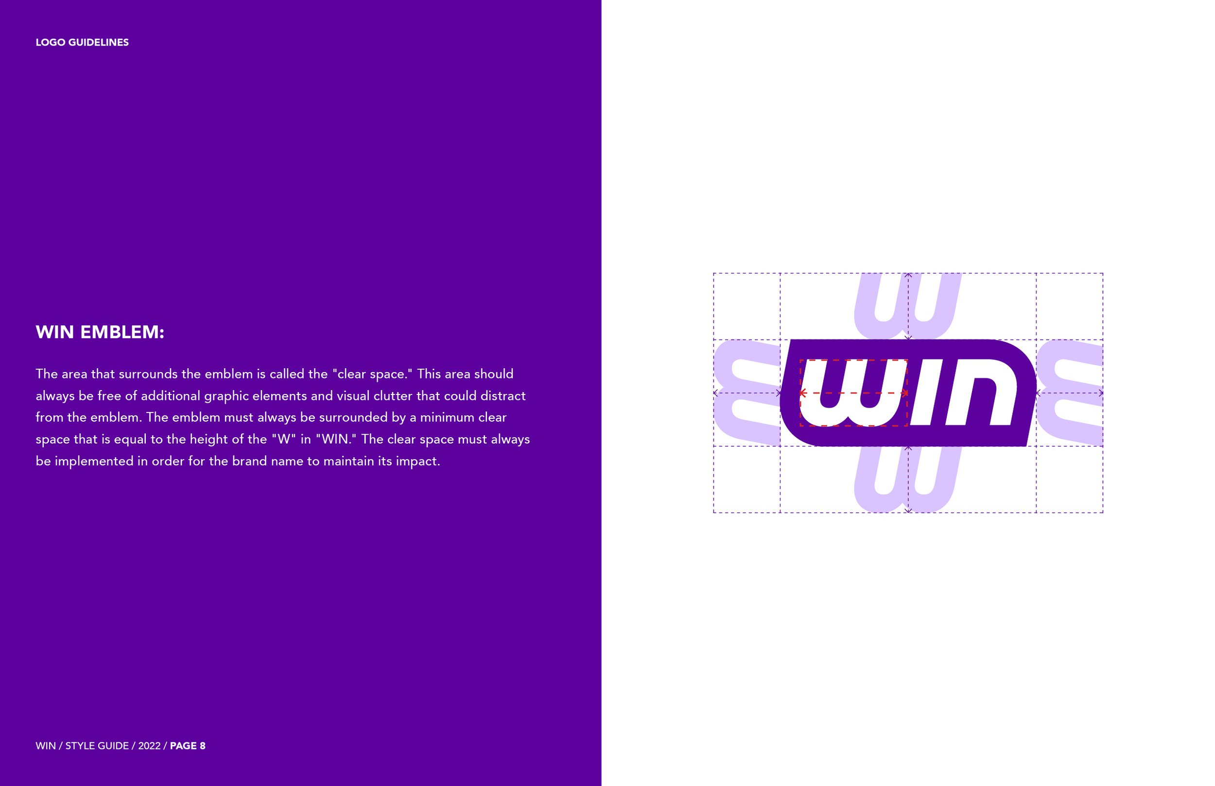
I designed the WIN emblem to feature a shape that embodies the essence of progress with a forward-leaning design. Its outer shape is friendly, organic and feminine with curves yet bold and compelling with edge. This emblem, which draws inspiration from superhero emblems, encapsulates what WIN looks to instill into its members.

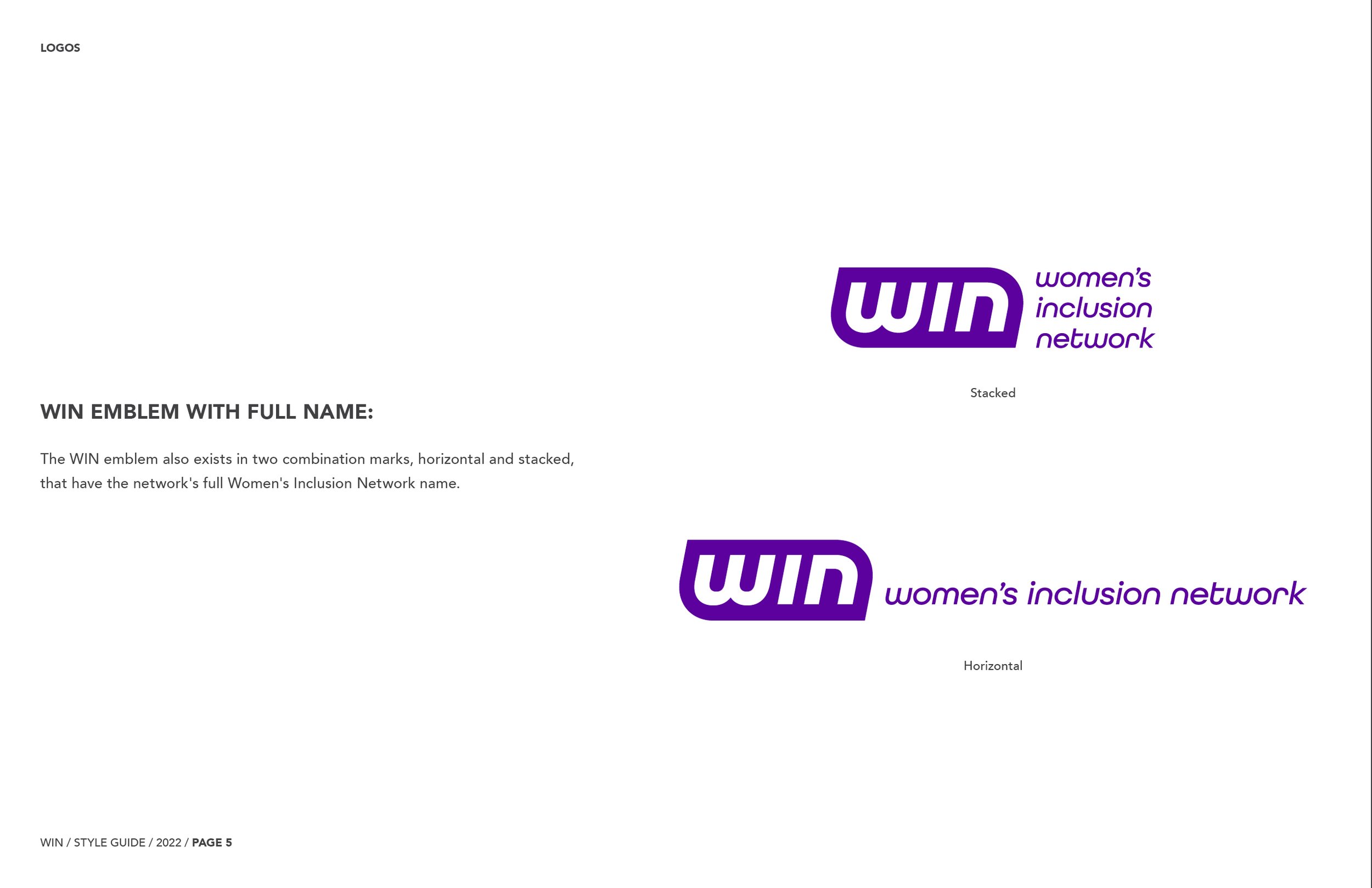
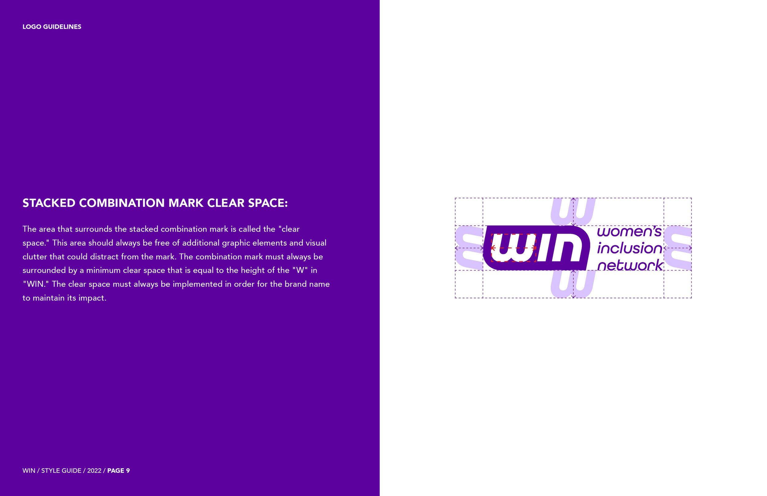
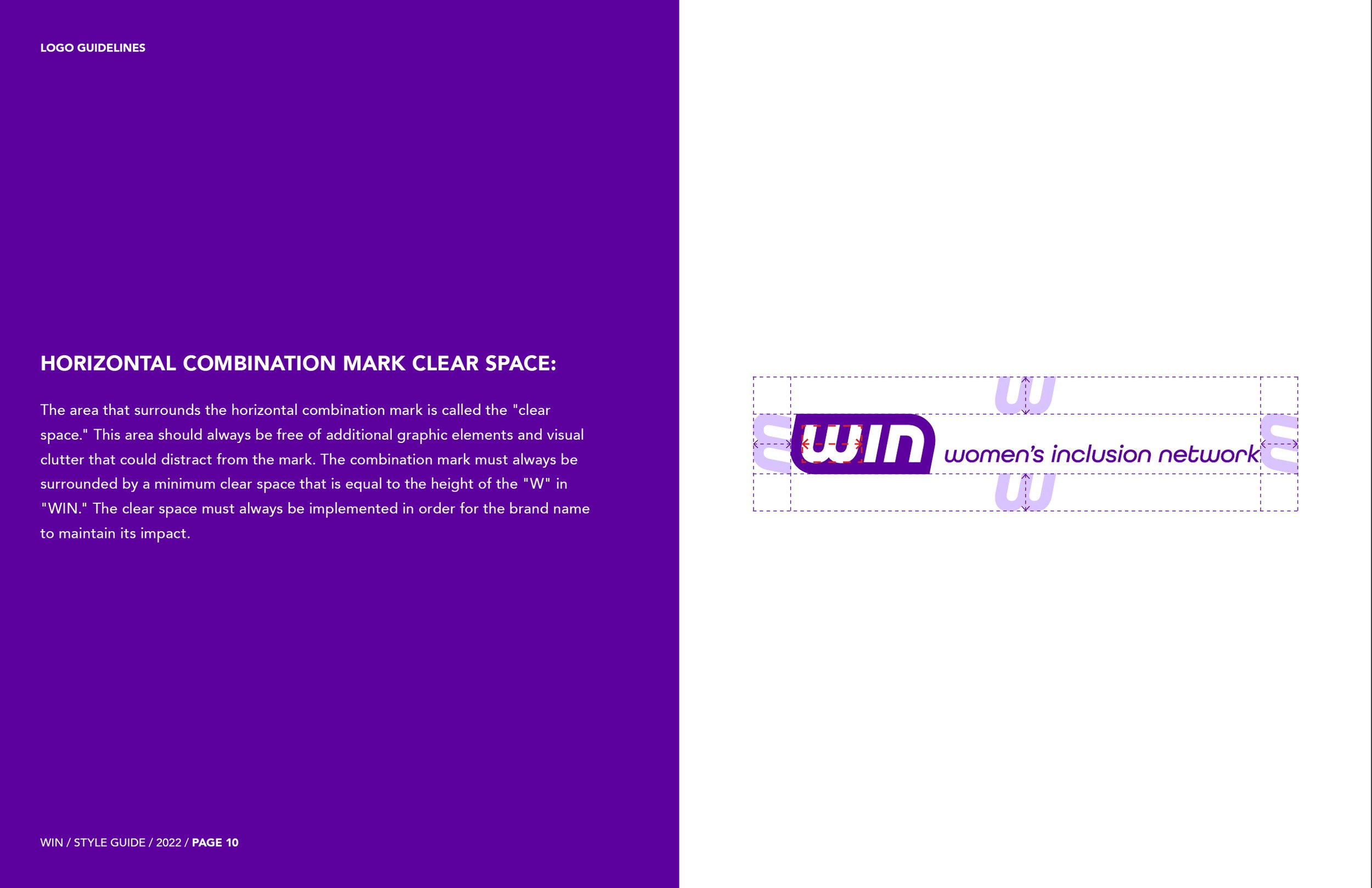
I also created lockups combining the emblem and the full Women’s Inclusion Network name.

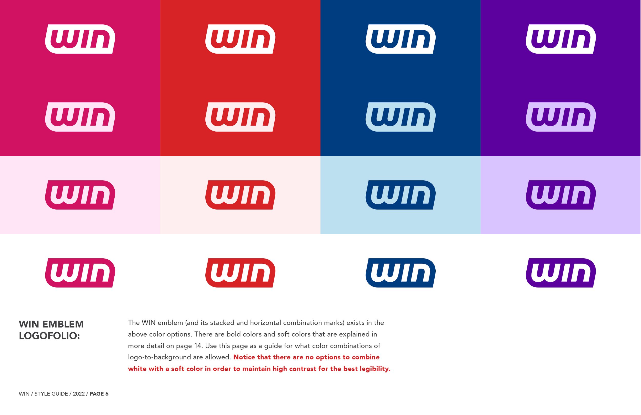
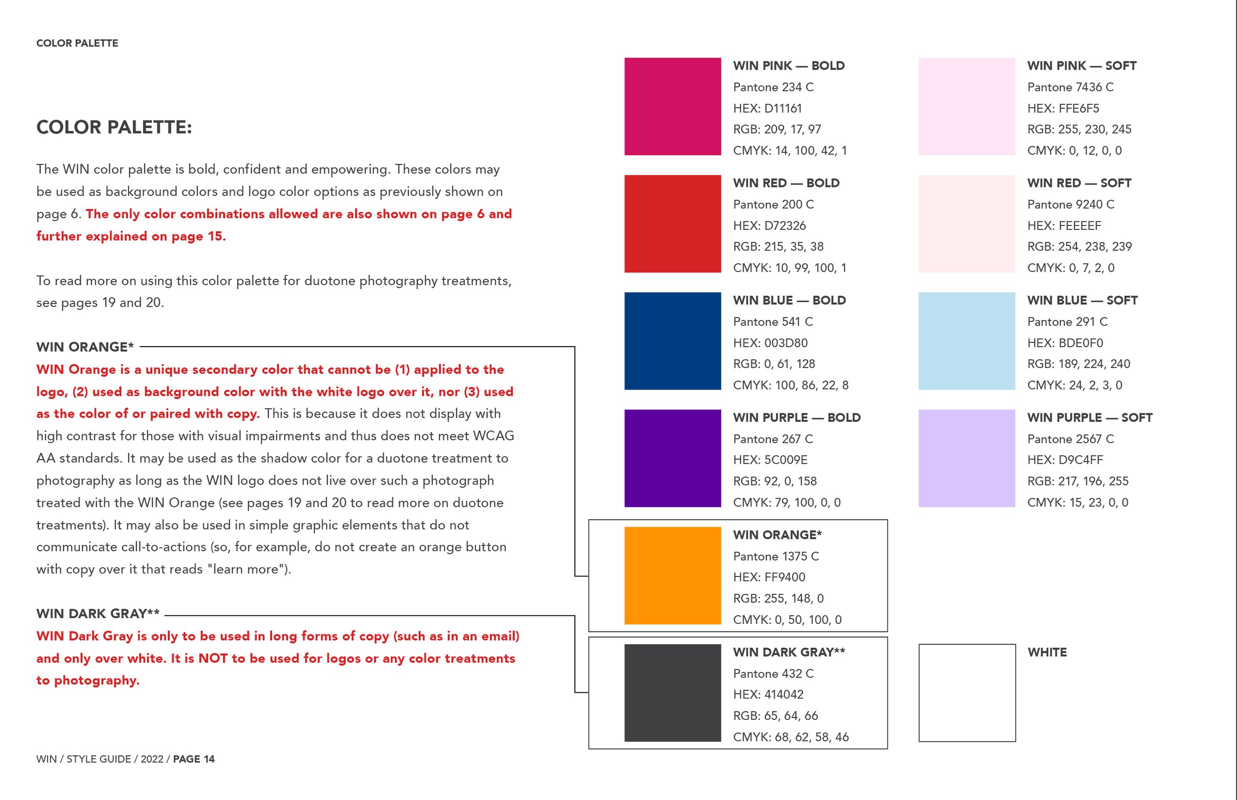
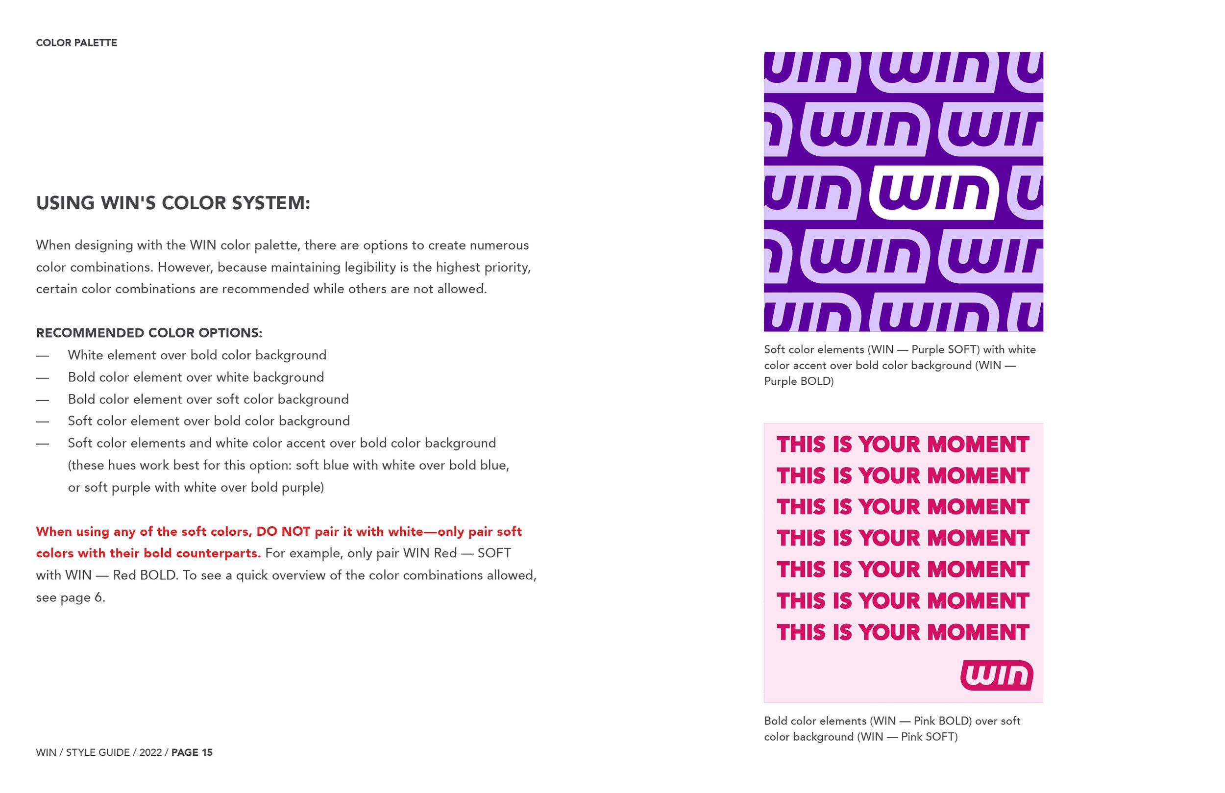
The WIN color palette includes a collection of bold, empowering colors that are complemented with subtle hues. These colors have an energy that WIN can instill in its participants. Additionally, I strategically tested these colors against one another to pass WCAG AA standards, keeping those with visual impairments top of mind.
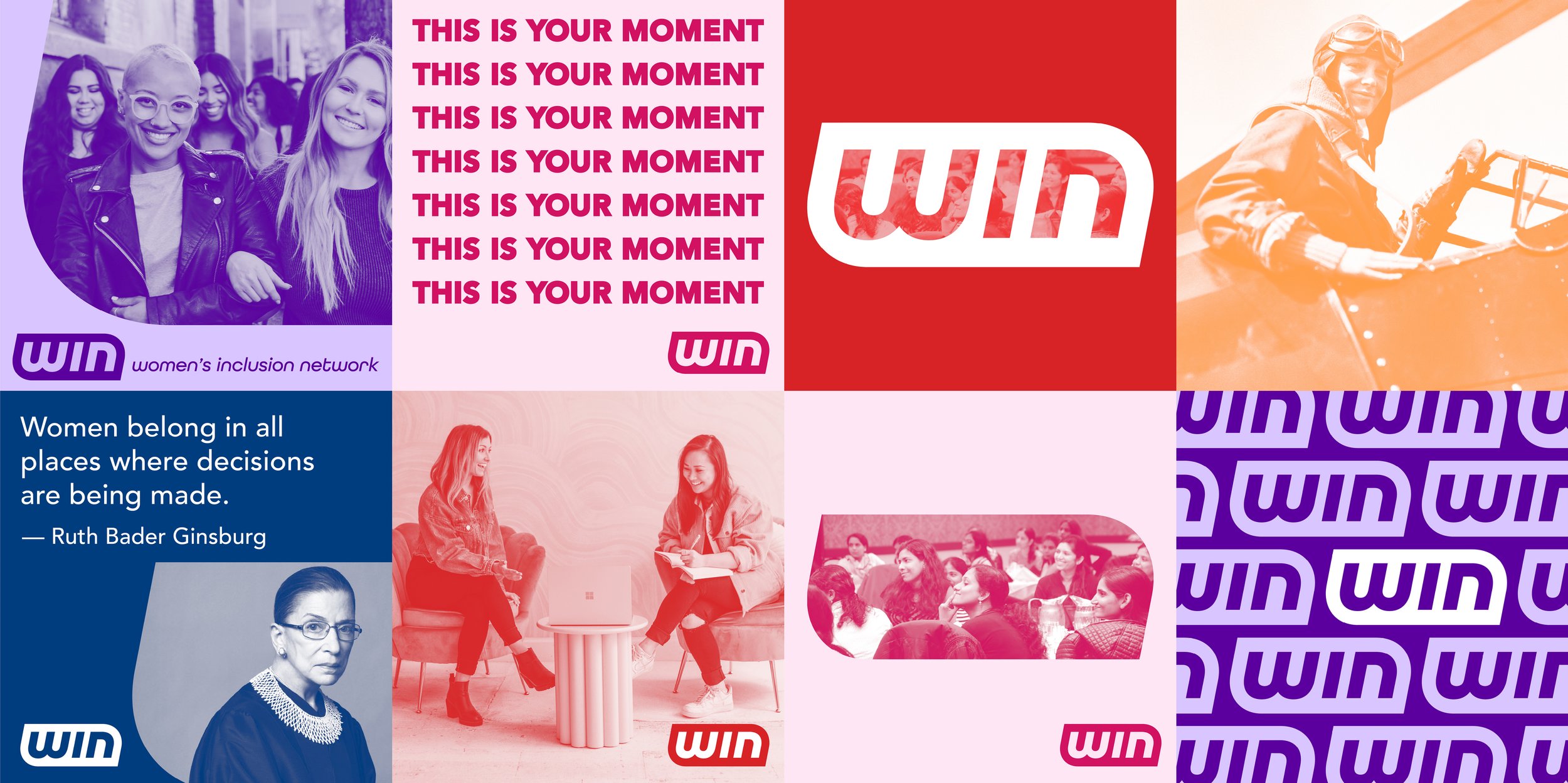
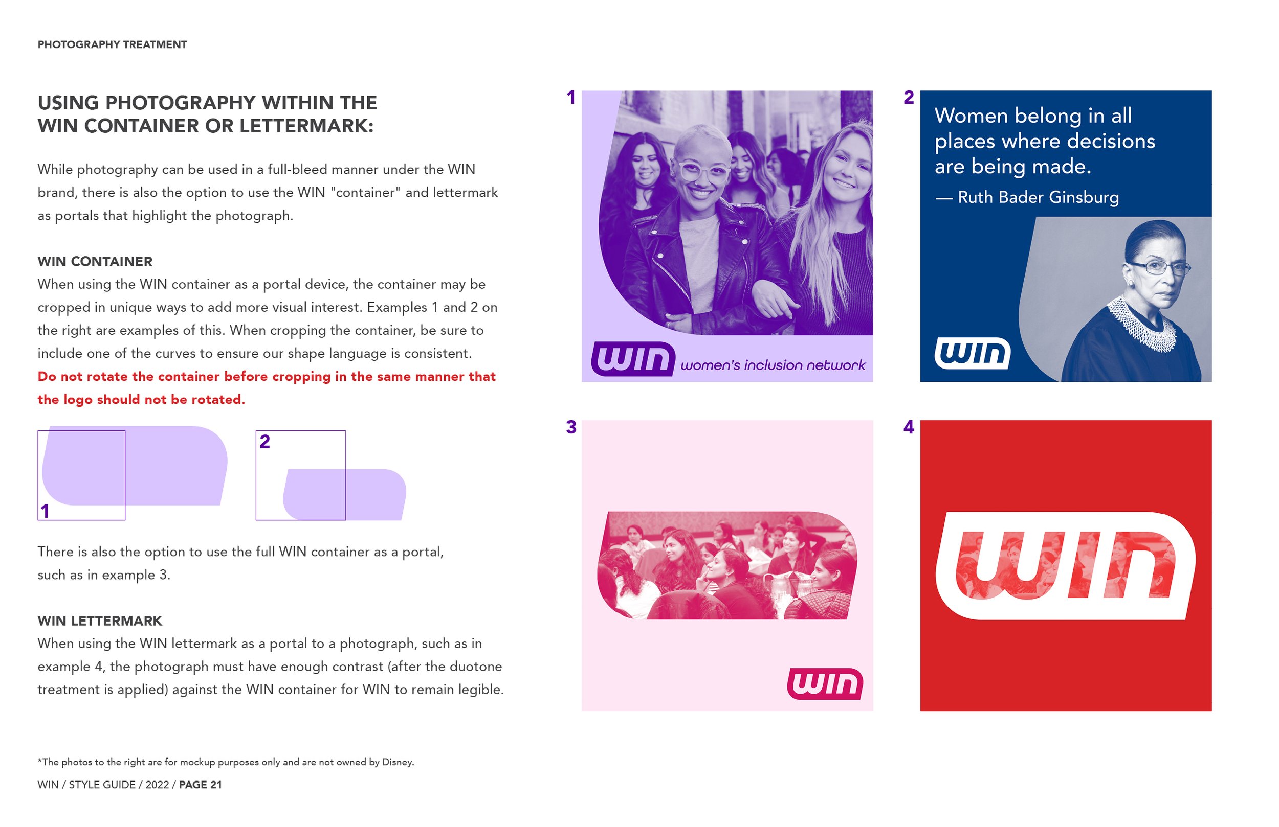
I had a great time developing a collection of graphics to show the incredible people at WIN how they can experiment with their new branding. These examples showcase how the brand colors complement each other and how the abstract shape of the logo can be further used as a dynamic image container.
Here, I introduced an orange color into the color palette to add a light freshness to the bold color palette, but due to its lack of contrast against white or lighter oranges, it does not pass WCAG AA standards and thus cannot be used for as a logo color. This orange is explained more in detail in the WIN brand guide at the end of this page.
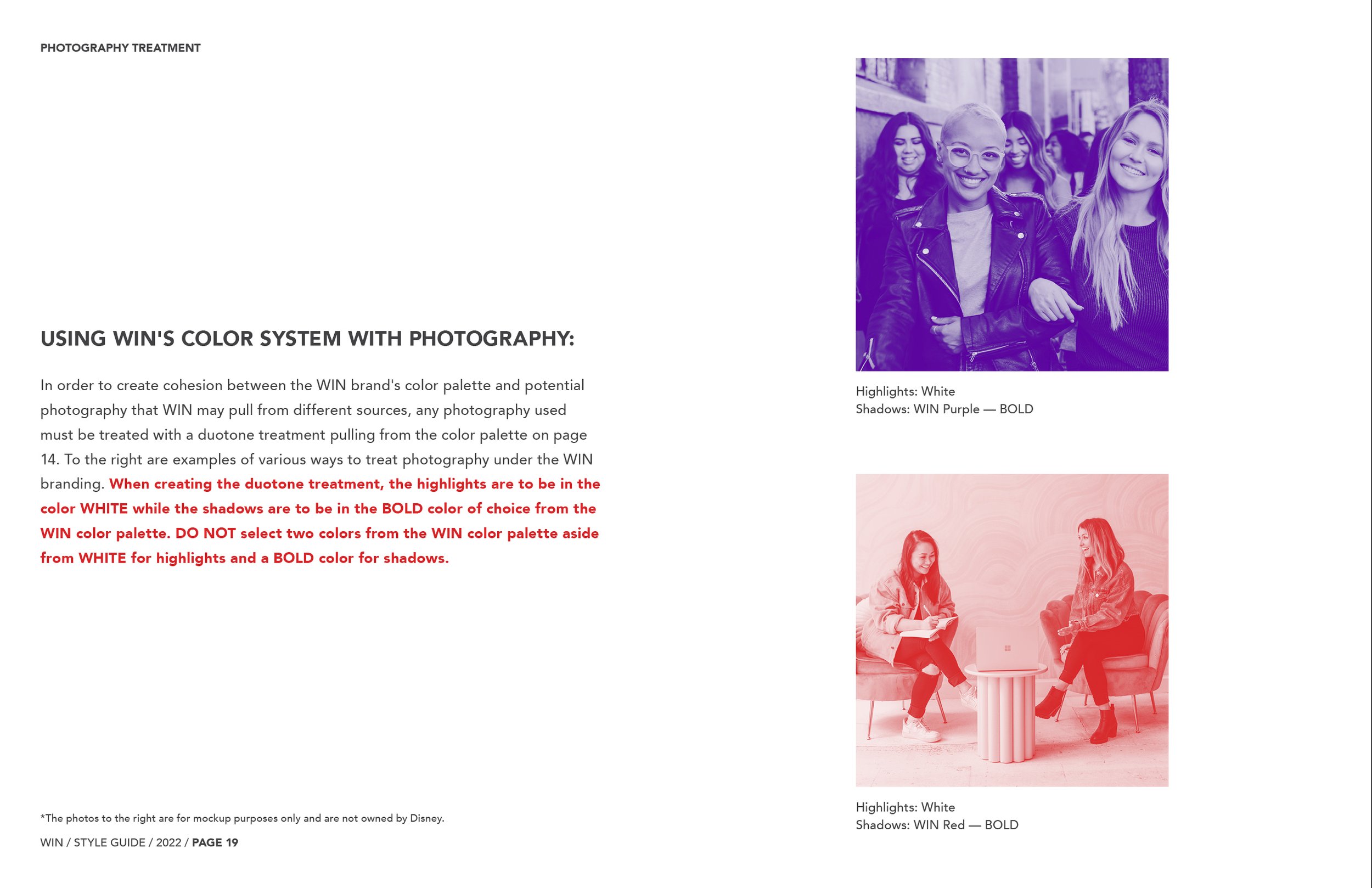
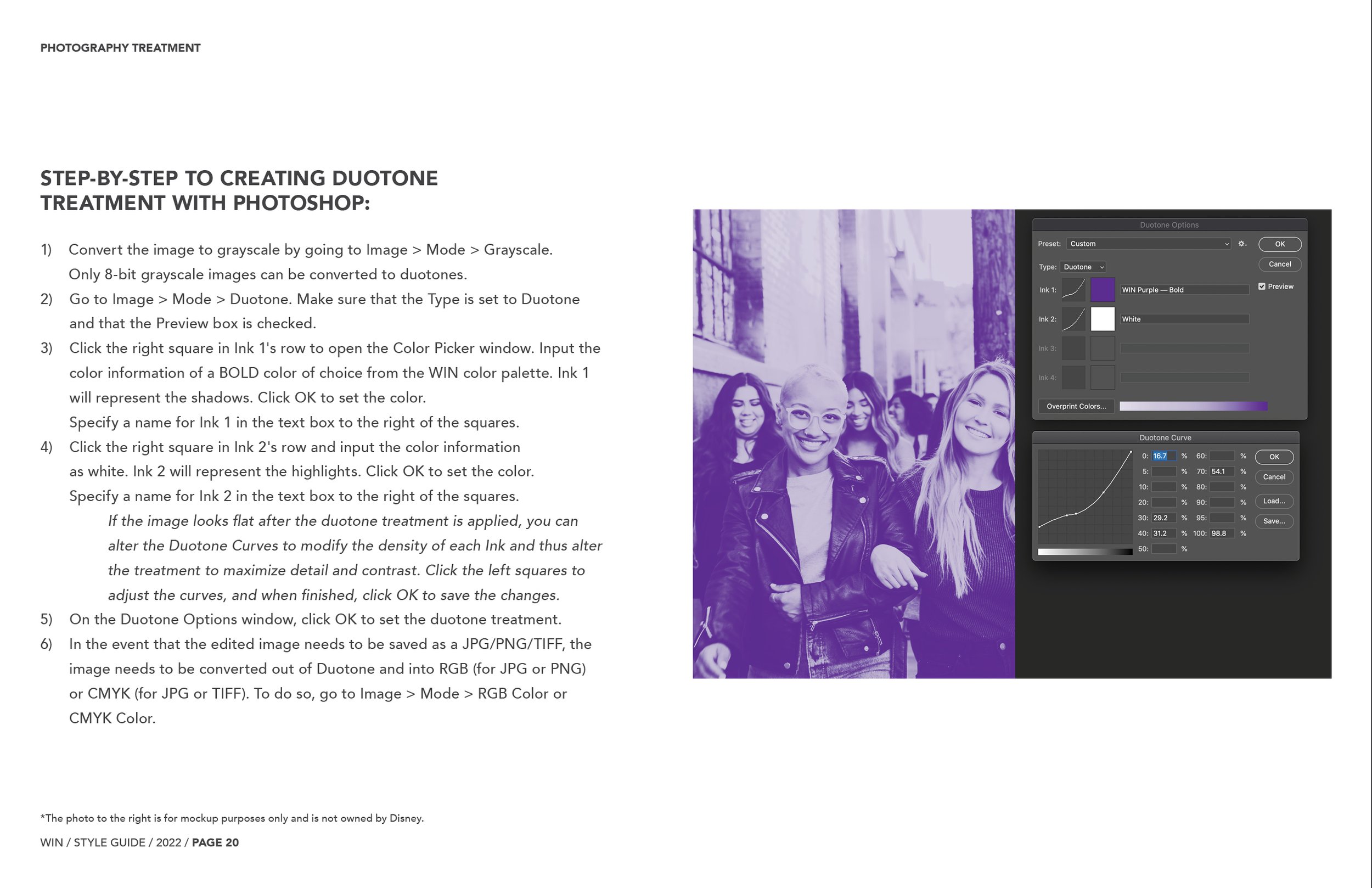
Additionally, I intentionally crafted WIN’s new photography treatment to be duotone to unite the look and feel of these photos that may come from all kinds of sources, whether internally or externally through stock websites and more.

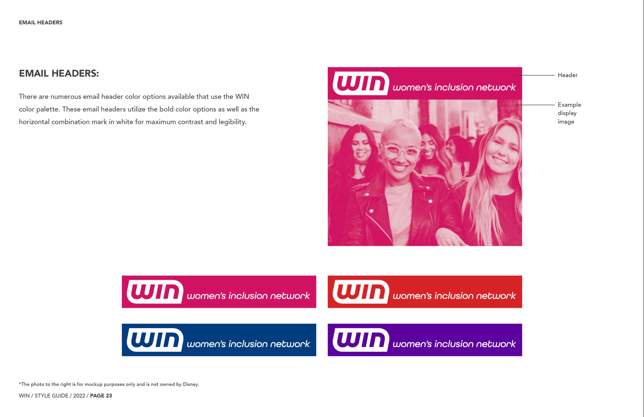
The previous experimentation naturally led to forming how this brand could live on social media.

The WIN emblem features the perfect shape to be created as pins for newly-joined members.

Furthermore, WIN members can bring WIN more into their daily lives through various applications.

WIN’s branding beautifully extends into stationery.
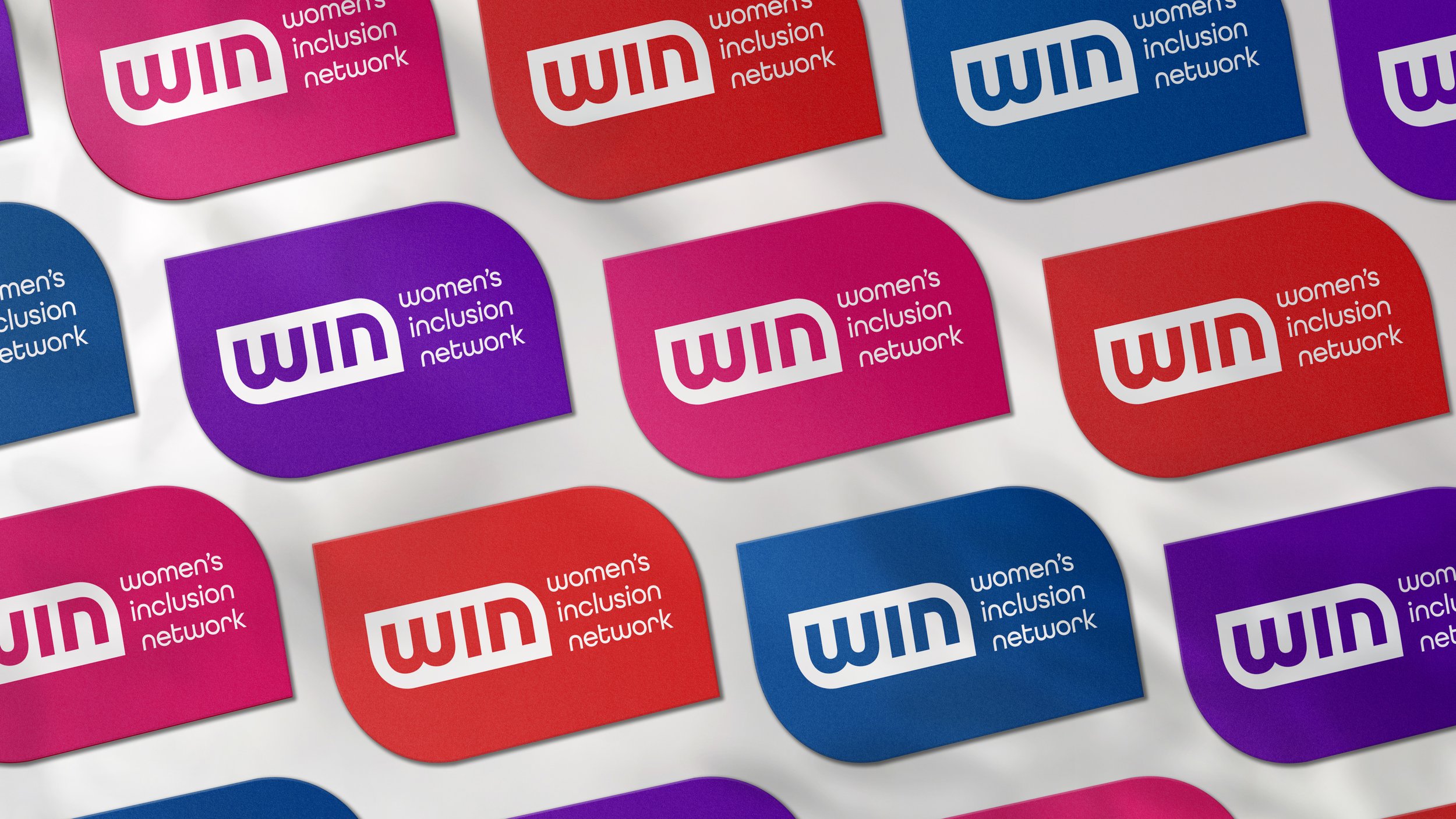
With this new WIN emblem, I just knew I had to develop business cards featuring its dynamic shape, making them boldly demand attention amongst standard business cards.At networking events, these business cards can be randomly passed out to guests who must then meet others with the same color card as them. This randomized activity would allow guests to freely greet each other without regard for differences in industry or career hierarchy, thus providing guests the opportunity to form unexpected connections.
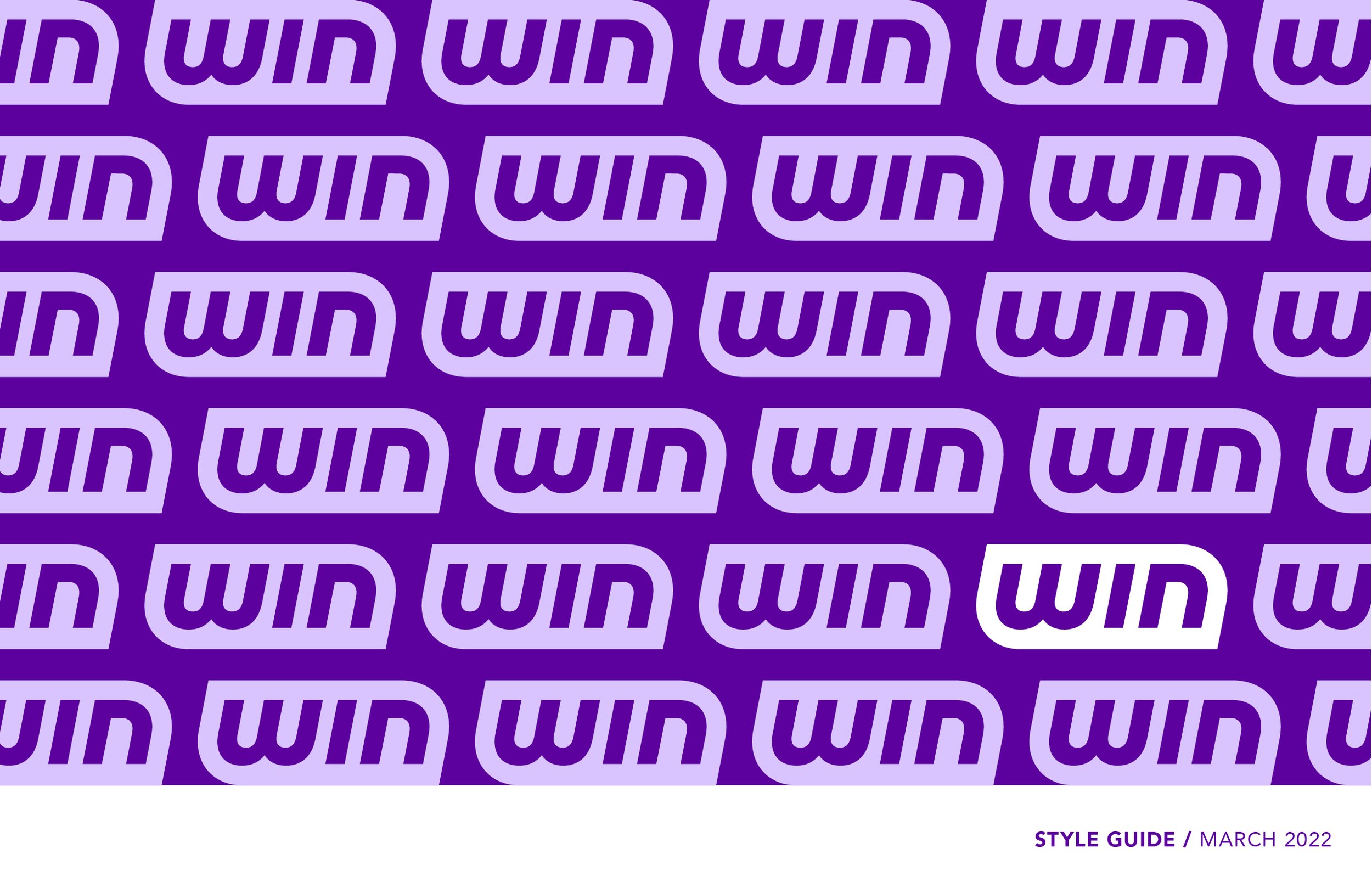


To read more on WIN’s brand guidelines, check out the style guide I designed above!
Client — Women’s Inclusion Network at The Walt Disney Company
Year — 2022
|
Designer + Style Guide Copywriter — Unitha Ramirez
Group Design Director — Agnete Oernsholt
̌