Milk-T
Milk-T's tea enhances the tourist’s Hong Kong experience by offering authentic Hong Kong milk tea on-the-go as well as providing transportation information beneficial to the traveler.
Project:
Milk-T
Awards/Achievements:
2017 European Product Design Award — Honorable Mention in Packaging Design/Beverage
2017 GDUSA American Package Design Award — Students Category
SCAD Secession 2017 Graphic Design Showcase — Bronze Award
Milk-T is a company based in Hong Kong that produces a variety of milk tea beverages. Their beverages enhance the tourist’s Hong Kong experience by offering authentic Hong Kong milk tea on-the-go as well as providing transportation information beneficial to the traveler.


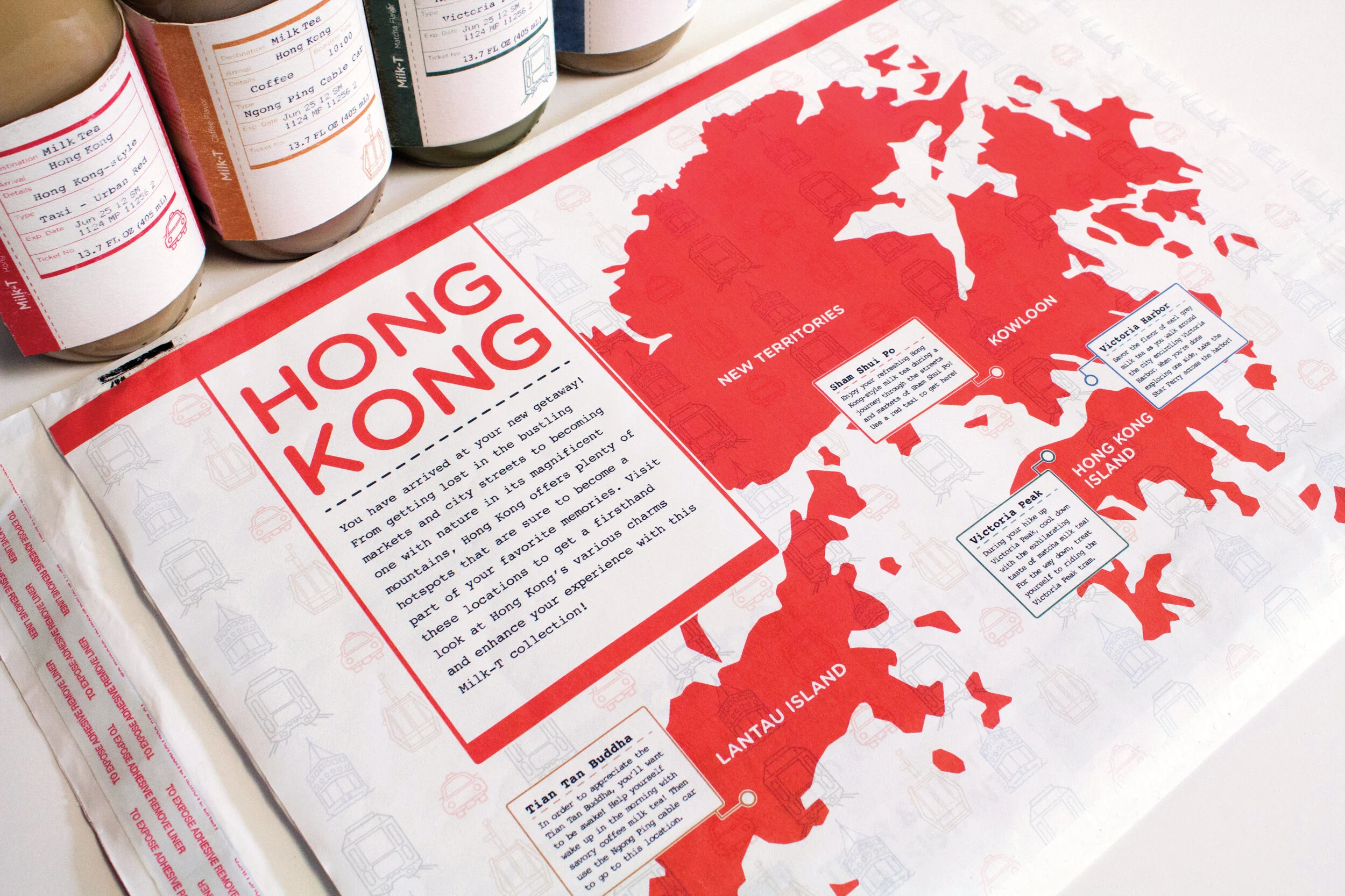
To represent the milk tea flavors, I created icons portraying a variety of Hong Kong’s modes of transportation, which are also identifiable through their distinguished colors.

The taxi label’s red color represents the urban red taxis that can transport users to almost all parts of Hong Kong and also relates to the red of the Hong Kong flag, making this label’s flavor Hong Kong-style milk tea.
The tan color of the Ngong Ping cable car’s label relates to the color of the coffee flavor milk tea it represents as well as to the color of the Tian Tan Buddha statue the label directs the tourist to.
The green color of the Victoria Peak Tram’s label reflects the matcha flavor of the bottle as well as the greenery of Victoria Peak.
The blue color of the earl grey flavor milk tea reflects the blue of the harbor that the Star Ferry calls home.

All flavors, transportation information, expiration date, and bottle size details can be seen on the front of the bottle labels which are designed to look like ticket stubs to emphasize the idea of traveling and enjoying such destinations with a cold refreshing bottle of milk tea. This is also a thematic treatment that helps unite the bottles as one brand and concept.

Each bottle label highlights a specific location of Hong Kong through an illustration combination of vector linework and watercolor painting. Above each illustration is a description of the milk tea flavor and the Hong Kong destination the traveler should enjoy it at.

As an extra interaction, the ticket stub portion of the label is perforated and has a call for the user to detach the ticket. On the back of the ticket is a small description of the location on the milk tea bottle as well as some information on how to travel to that destination using the mode of transportation for that flavor.


For the outer package, I designed a shipping envelope which would hold the four bottles of milk tea that could be purchased as a set. On the shipping label are fun treatments of information, like specifying the receiving address of the package as “your shopping cart.” The sender’s address is an address in Hong Kong to imply that this milk tea is authentic to Hong Kong. The outer package being a shipping envelope conveys the idea of travel without being a luggage or briefcase, and would also be a great way for the product to stand out in a grocery store’s refrigerated dairy section.